Level Design: Jelly Car 3
The majority of my time since April has been spent at the Disney Interactive Media Group’s mobile division, where I design levels for two very important franchises. During my first few weeks I created levels exclusively for JellyCar 3, and from then on I worked as a level designer on an exciting new property. I am not ready to talk about the latter just yet, but JellyCar is fair game!
While the rest of the Creature Feep team, led by JellyCar series creator Tim FitzRandolph, began work on our next game, it was my job to create JellyCar levels to be released as downloadable content throughout the remainder of the summer. Three of those levels have already been released as part of the “Adventure” pack, with two more slated to be released over the next few weeks.
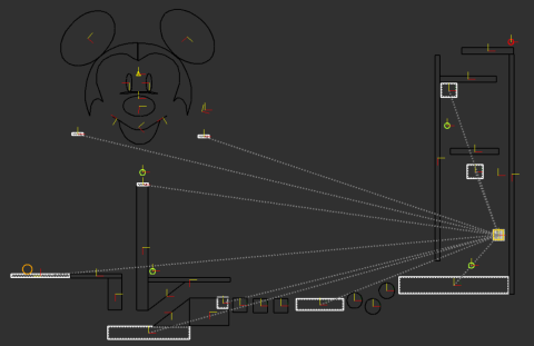
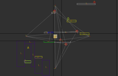
I have included videos and descriptions of each level I created, in addition to the level layout as seen through our proprietary level editor. The levels were created entirely in the editor, and throughout the design process I was able to either create my own assets or use any assets created for prior levels. Additionally, I could manipulate the various properties of any given object, including mass, material, “squishiness,” and of course, motion. The connection between objects that trigger motion in other objects is visually depicted by a dotted line, and the motion is programmed through a separate user interface.
One of my greatest delights as a game designer is to surprise the player, a challenge that is inevitably made more difficult when working on a sequel. I quickly established a golden rule for myself: if it already exists in the game, it is not worth creating. The five levels I designed all stretch the capabilities of the level editor, and I believe each offer a wholly unique experience. Without further adieu, here are the levels I created for JellyCar 3.
X-Ray
The high level concept of “X-Ray” is rather simple: hitting a white block reveals the outline of the level for a few seconds, after which the level vanishes until the player reaches another white block. I is designed to challenge short term memory and spatial awareness while simultaneously introducing a new concept to players. X-Ray was my first level to use specially colored blocks to alter the environment, a concept I continued to play with in several of my later levels.
My inspiration for X-Ray was somewhat of a happy accident. When I began tinkering with the level editor I noticed that when an object in the foreground overlaps an object of the same color in the background, it is given a grey outline to keep it discernible. I took advantage of this feature by creating two gigantic black squares, placing one as the closest object to the foreground and the other as the closest to the background. Between the two squares I designed the level layout and carefully determined the location of the white blocks. Because the white blocks are triggers, they are always visible to the player regardless of their position in the object hierarchy, making them perfect guides to move the player in the right direction. When the player’s car touches a white block, the giant black square in the foreground is lifted for a few seconds and the level layout is revealed. The grey outlines of the level on top of the black background produces a visual effect similar to that of an x-ray. For the diehard, I created several unique assets to form a Mickey Mouse face that envelops the level’s secret exit.
The video appears overly dark, so please download the level to learn more!
Jelly Pinball
At its core, JellyCar 3 is an enjoyable game because it is fun to play with physics. Another one of my favorite games that asks the player to take physics into consideration is pinball, and I thought it would be fun to combine the two.
“Jelly Pinball” has all of the features you would find in a classic pinball table, from the launchers to the bumpers, but in this rendition you play as the ball in a machine made out of jelly. Each bumper is a trigger that opens one of three gates when touched, and when all of the gates are opened the level exit is revealed. The secret exit is quite a bit trickier to reach. To obtain it the player must first cross the gaps at the peak of the stage to reach a tiny bumper that causes the entire top of the table to open up. The table top forms a bridge leading to a Sticky Tires power up that enables the player to traverse along the outside of the table to reach the secret exit. The secret exit is visible at the very start of the level, acting as a carrot on a stick to encourage the player to seek it out.
Jelly Pinball was a challenging level to design because the flippers strike the car at a high speed and at an unnatural angle, often causing the car to “break” (an instance that occurs when the game can no longer handle the way the car is positioned). I had to find the perfect angle and speed that would allow players to have fun with the level without worrying about the JellyCar breaking down.
Crazy Wheel
For some reason I became obsessed with the idea of a level that the player could spin, and that idea ended up turning into “Crazy Wheel.” Specially colored blocks are once again used to introduce the level specific spinning mechanic. The level spins 180 degrees whenever the player touches a black block, and the only way to reach the exit is to spin the level to fill gaps that would otherwise make progress impossible.
Crazy Wheel was painstakingly difficult to create for both technical and design reasons that I did not take into full consideration when I initially came up with the idea. On the technical side I ran into a huge problem right off the bat. Every object in JellyCar 3 rotates about its center point, but unfortunately there is no way in the editor the move the center point of an object. This proved problematic because the level’s spinning effect could only work if every object rotated about the origin. My solution to this problem was hardly elegant: I created every asset in the level from scratch and calculated the proper distance from the origin for the individual vertices of each and every one of them. Playtesting of course unveiled problems with the placement of certain assets, which meant I had reevaluate the vertices’ distance from the origin or recreate the asset in question since simply moving it would ruin the synchronous spin.
From a level design standpoint, it was difficult to keep track of the level’s critical path while adding new elements, since the level was essentially divided into two separate halves. I redesigned the layout seemingly every ten minutes, always struggling to balance the introduction of a completely new style of gameplay with level design that felt engaging rather than automatic. Players struggled remembering the previous location of the constantly shifting pieces, and as a result I added white blocks that are not affected by the spin. I also restricted the level to just four colors to communicate the concept as clearly as possible. Black indicates a spin block, white indicates an object that will not spin, and red and blue indicate objects that will spin.
My goal for “Quilt” was to create a level that would seemingly take away control until the player is able to recognize the level’s pattern and formulate a strategy. The red squares move horizontally and the blue squares move vertically, and if blindly approached they will usually carry the player back to the level entrance. Once the pattern is recognized the remainder of the level is a pure timing test.
Quilt is full tricks I learned from my previous levels. The simply color scheme highlights the concept without distracting the player’s attention, the blocks seemingly vanish from the edges of the screen similarly to visual effect in X-Ray, and after Crazy Wheel it was no longer daunting to keep track of dozens of object paths.
Growth
I knew from the get go that “Growth” would be the last level I would design for JellyCar 3 and possibly the last level ever released for the game. By this time it was clear that we were moving on to bigger and better things (that you will be hearing about soon), so I decided that it would be appropriate for the final level to start small and end big.
The level layout for Growth looks like a confusing mess of triggers in the editor, but hopefully you can get a feel for the layout from the concept sketch. Every time the player hits a red block, the four walls move outward to reveal more of the level, and in game the effect looks like the level grows right before the player’s eyes. The level components serve different purposes as the level expands; what was once a barrier is now a bridge. The secret exit is hinted at halfway through the level, and should the player remember the visual cue by the time the level is fully expanded they can use a balloon to acquire it.
And that’s it! I had a blast working on JellyCar 3, and I hope you will have as much fun playing my levels as I did making them. You can be sure to expect a similar blog entry in the near future detailing a whole lot more level work for...
Well you’ll just have to wait and see!


