Finding the Feel: The Level Design of "Where's My Water?"
For the last few weeks I have been contemplating the best way to sum up my design process for "Where's My Water?" in a blog entry. I ended up writing an essay on this exact process for a writing class at USC, but because of the nature of the assignment I had to use a different tone and style than the more conversational voice I use to address my audience on Defiantly Digital.
So I spoke with my Dad (the best writer I know) on whether or not it would mesh well with the rest of the site, and he suggested writing a blurb at the beginning of the entry, exactly as I am doing right now, to prepare my audience for a different tone and style. He also politely reminded me that I'm writing for my own website, not The New York Times.
Touché Dad. On to the essay!
The most appropriate way I know to begin a discourse on level design is to highlight the distinction between a level designer’s task and purpose. The level designer’s task is to create the spaces the player occupies throughout the course of the game. Their purpose is to manipulate behavior.
A level designer is a digital architect that uses mechanics, the learned behaviors in a video game, as building blocks. They determine how to teach their audience a mechanic and subsequently test varying degrees of proficiency. Knowledge of the player’s learned mechanics and information is the level designer’s most valuable tool.
Underneath this almost mechanical description of level design is an idea much harder to quantify. While every level designer shares a similar overarching task and purpose, another distinction must be made to separate the good level designers from the rotten. A good level designer understands what I call “the feel,” an abstract concept that simply refers to the emotional reaction a player experiences to an interactive event. The feel is an all encompassing concept that governs every single interaction within a game, from player movement to the time it takes to pull a switch. It has two states with varying degrees: wrong and right. The creation of a level’s geometry is a useless task if the geometry cannot push the player to perform the correct action, and pushing a player to perform a specific action is also useless if the action’s execution feels awkward and clunky.
Task, purpose, and feel are the three components of level design that I defined as my governing principles while crafting levels for Disney’s “Where’s My Water?”. In order to assist in transforming the concept of playing with water physics into compelling puzzle game, I was tasked with creating spaces that would turn the normally smooth journey from water to a bathtub into a far more complicated process. My purpose of course did not involve the manipulation of water physics, but of human behavior, and thus determining a level layout that would push the player along the correct path to a puzzle's solution became a matter of utmost importance. Naturally it was always preferable for the level layout to allow for playful experimentation, as long as such experimentation did not lead the player to mistake an incorrect approach for the proper solution. But it had to feel right.
Until a level felt right it was considered a failure, regardless of whether or not it accomplished its task and purpose. My team used the word "kludgy" to describe a multitude of occurrences that would cause a level to feel wrong, from not providing enough screen space for a difficult section of a puzzle, to the feeling that a solution was reached due to accident. Occasionally we did not have a concrete reason for why a particular level felt kludgy, and so we trusted our gut instinct.

The Creature Feep team
I found it essential to keep the feel at the forefront of my attention, because it was this abstract concept that governed a more mechanical operation. Level design certainly requires a great deal of artistry, yet in certain stages of a level's development the technical process overtook the artistic.
Every level, regardless of whether or not it would appear in the game, was stored in a Dropbox folder that every member of the team could access. Our creative lead integrated Dropbox within our development game builds, enabling us to freely make changes to any content within the game without having to deploy a new build to see the changes reflected. For example, if I created a level layout in PhotoShop, I could save it to my Dropbox folder and immediately make changes to the level in my development build without having to go through a convoluted and time consuming export process. This system saved an extraordinary amount of time and hassle.
Another system was created to help reduce the level designers' reliance on other members of the team which came into play during the "draw" stage of level development, but I will save the details of this system for later.
My level design process was spread across five stages and three screens. I referred to the stages as brainstorm, draw, place, code, and test. I utilized a Dell monitor, MacBook Pro, and iPad to simultaneously accomplish specialized tasks in each of the five stages. The brainstorm stage was exactly as it sounds: pure idea generation. Despite require little to no use of technology, I found this first stage to be the most difficult. Every member of my team at Disney, myself included, were firm believers in the idea of a "high level concept," a matter of fact idea that illustrates what the designer hopes to express, and the brainstorm stage's core challenge was to create a compelling high level concept. However, should a new high level concept appear too similar to that of an already successful existing level, the new level is usually scrapped. Therefore, it was crucial to come up with an original high level concept for each level created. For example, suppose my high level concept involved a solution that required the player to find a way to give the water enough momentum to clear a gap (as seen in "Do a Sweet Jump"). Now suppose that a level already existed with a similar concept. Regardless of the layout that the levels used to illustrate this concept, they both expressed the same idea, therefore it would be redundant to include both in the final game. Until the final stretches of development, it was always more useful to fill an empty slot with a new level concept than replace an existing level by expressing its concept differently. Coming up with a compelling and original high level concept was a daunting and difficult task, and I filled plenty of garbage cans with poor concept sketches of ideas that never came into fruition.

The draw stage marked the beginning of the transition from paper to screen, conceptual to concrete. The level layouts were drawn in PhotoShop and loaded into the game with the system I alluded to earlier. Designers were given several different materials to work with when creating the layouts (dirt, rock, water, etc), and each material was represented in PhotoShop as a color. The PhotoShop files were exported as PNGs, and when the game read the PNGs it translated the colors into their corresponding materials. This system allowed a designer and an artist (I should say theartist, we had only one) to work independently from each other, for the artist could update or create new textures when needed, which would be immediately reflected in all of the levels. A designer could create levels without requiring art, and the artist could create art assets without requiring level design.
The dimensions of the PhotoShop canvas were set to 90 x 120 pixels to match the screen size of the iPad. Originally we designed the levels at 86 x 120 pixels for the iPhone, but had to resize and subsequently redesign a fair number of the levels in order to support the iPad as well. The iPad's extra two pixels on each side of the screen could not contain any content necessary to complete the level, since they would not appear on the iPhone version of the game. If the canvas height exceeded 120, the game automatically determined the level to be "deep," meaning it would require the player to use a scroll bar to see the entire layout. Most deep levels were either two or three screens deep, with dimensions of 90 x 240 and 90 x 360. Swampy's bathtub covered a significant portion of the game screen, further limiting the amount of screen real estate available for the puzzle. We developed a visual language to be used in every level that dictated how to place rock shadows and highlights, what angles were acceptable and unacceptable for certain materials, and how close level content could come to the heads up display before it was considered a "HUD crowder." Once drawn, the designer loaded the empty level into the game build to place objects.
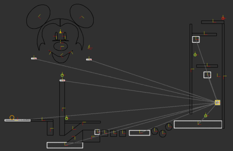
The objects used in the place stage consisted of every man-made or unnatural item found in the game. These ranged from water spouts to bombs, and were accessible through a large list within our in-game editor. The editor was created exclusively for development purposes and was only accessible in the game build, therefore I found the iPad to be the most practical tool for this stage of development because its large screen real estate made small adjustments possible. Aside from access to the object list, the editor included interfaces for selecting objects, moving objects, duplicating objects, rotating objects, linking objects, placing tracks between objects, moving objects into the foreground, and for a few other practical uses. Many of these interfaces were not present in the original version of the editor and were later added to assist designers as the level designs became more intricate. The interfaces turned manipulating objects into a rather simple task made more visceral by the iPad's multitouch screen. Designers could drag objects across the screen using one finger, and could rotate the objects with two fingers. An object could be linked to another by selecting both objects and pressing an onscreen button, which would inform the game that first object would trigger an action in second. The actual actions that would occur as a result of the trigger had to be specified in code, but the editor's visual interface removed the annoyances that came from implementing core gameplay concepts in the code every time work began on a new level.
The level code, not to be confused with the game code, was done in XML. Objects were defined by a start and end tag, and between the tags the designer was free to manipulate any of the available properties. The available properties were described in a text document and were divided into categories based on their corresponding object. Spout properties, for example, allowed a designer to change the type of fluid the spout contained, the angle and direction in which the fluid shot, the number of particles ejected, and so on. If an object was linked to another, its resulting movement could be handled within the code by adding a motor and manipulating its properties. Like the level editor, several properties in the game code were created as development moved forward and level complexity increased. While creating the level "Under the Radar," I struggled to find a way to make the bombs rotate around a center point because we had no game logic to support the execution of this concept. I spent a few hours plotting each bomb's trajectory in Excel, and I input the coordinates each point along the trajectory into the code. This solution was far from elegant, and we later added logic to simplify tasks of this nature.

Some of the levels I created for "Where's My Water?"
The first four stages all dealt fundamentally with either task or purpose, but the test stage was unique in that it dealt with feel. Every change made to a level was tested immediately, regardless of how minute, because every change altered the feel. If the player was given less water at the start of the level resource management would become a priority, just as the subtraction of obstacles would lower the difficulty of a given level. Some changes to the feel were more difficult to identify. A frame of rock would cause a level to feel overbearing, while keeping the top of the screen empty would cause a level to feel more relaxed. No matter how a change affected the feel, it was only identifiable in the test stage. I tested my levels hundreds of times before showing them to the team, who would test them a few times and usually reveal problems that I could not have seen due to my knowledge of the solution. Our formal playtest sessions were the most revealing because the game was played by groups with no prior knowledge of the mechanics. I do not mean to suggest that the test stage is the last of the stages, for the level design process has no beginning and no end. It is not sequential, but cyclical, and the five stages often take place out of order or simultaneously until a level feels just right.
Words cannot do justice the euphoric sensation of finding the right feel, but a good designer can satisfactorily explain why it is achieved. When a particular combination of geometry and numbers elicits a particular reaction, it often feels like magic to the player rather than the result of careful planning, tweaking, and calculation. Every interaction has a feel, and when used in conjunction with one another, a level designer can encourage a player to voluntarily engage in a sequence of strange behaviors. However, if the behaviors have an intriguing feel, they seem natural rather than strange. The game development is long and often convoluted, but the coding, the concept sketches, the testing, and the level editing are all small components of process intent on making people feel differently than they would otherwise. Details disappear from memory in a mere few days after playing a well made game, but the feel is impossible to forget.


